Fresh tracks.
Same crew.
Trip titles and selected section headings. Keep it short and use sentence case. Avoid brush lettering in navigation, buttons, schedules, and paragraphs.
The same bolt, a familiar feel, and room for every trip to be itself.

Good dads.
Great adventures.
Warm, adventurous, practical. Real time together is the point.
One original mark.
Use the original artwork with its yellow fill, dark outline, and red offset. Preserve its shape and proportions. Leave clear space equal to at least one-quarter of its height.
Use at least 24 px of logo height; 40–52 px works well in a website header. Pair it with “Lightning Bolts” in a clean wordmark. Keep the round badge for existing gear and legacy uses.
Navy anchors the page. Cream gives it warmth. Yellow points to the next action.
Select a swatch to copy its hex value.
These pairs exceed 4.5:1 for normal text. Yellow belongs on dark backgrounds or behind dark text. Use red #D5543F sparingly as decoration, never as the only signal for status.
A little personality in the headlines. Easy reading everywhere else.
Fresh tracks.
Same crew.
Trip titles and selected section headings. Keep it short and use sentence case. Avoid brush lettering in navigation, buttons, schedules, and paragraphs.
Make time
for the good stuff.
Body copy, facts, times, forms and controls. Also use it for the main site’s cleaner headlines. Regular 400, semibold 600, bold 700.
Choose a reference to preview its color and type treatment. The logo and yellow action stay consistent.
Live style preview
Campouts. Rockets. Races. Time together.
Preview only. This control does not submit an RSVP or change an existing trip site.
Snow Ice #DCEBF0 / Alpine #2D6678
Camp Sage #E6EAD8 / Forest #3D5547
River Sand #F4E4CE / Pool #006C70
Make each trip useful on a phone, with one clear heading per section.
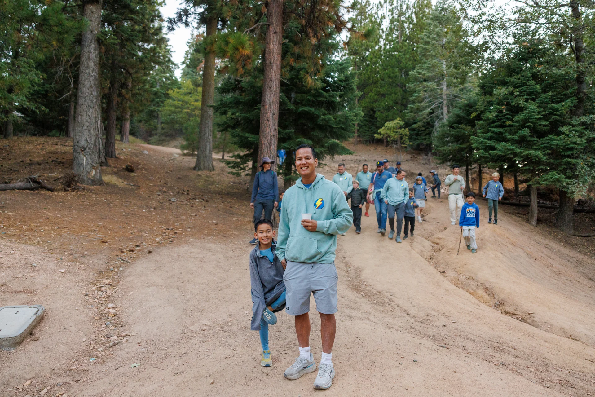
Start with the crew. Use venue photos for amenities and activities. Keep faces in frame on phones, show each image once, and make galleries optional. Keep source credits in the asset record; display attribution wherever required.
Warm, direct, specific. “Bring a favorite game” beats a paragraph of hype. Use “RSVP,” “What to pack,” and “Your weekend.” Don’t repeat the title in an eyebrow, headline and subtitle.
Explain pending lodging or pricing once. À la carte means not included in Bolts dues. A countdown uses the confirmed time and time zone. If only a date is known, count days without inventing a departure time.
Shared styling, real keyboard behavior, and enough restraint to stay out of the way.
Use one primary destination. If RSVPs are closed, offer the calendar instead.
Short labels, concrete answers. Link addresses to maps and contacts to email or phone.
Departure, arrival, and settling in.
A day of shared adventures.
Use arrows, Home and End. Every day remains readable if JavaScript is unavailable.
Visible labels, 16 px input text, and comfortable tap targets. This example does not save or send data.
Space 4 / 8 / 12 / 16 / 24 / 32 / 48 / 64 / 72 / 96 px
Shape 8 px cards · 4 px controls · no heavy shadows
Touch 44 px controls · visible keyboard focus · 16 px body
Motion Brief, purposeful · respect reduced motion · no autoplay
A portable foundation, with local fonts and the original logo included.
Start with the shared files.
<link rel="stylesheet" href="brand/tokens.css">
<link rel="stylesheet" href="brand/components.css">
<script defer src="brand/behaviors.js"></script>

<body class="lb-site"
      data-lb-theme="snow"
      data-lb-mode="trip">
Choose crew, snow, camp, or river. Keep project-specific CSS small. Copy the versioned kit into each project so updates are deliberate.